Case Study: Dive lab
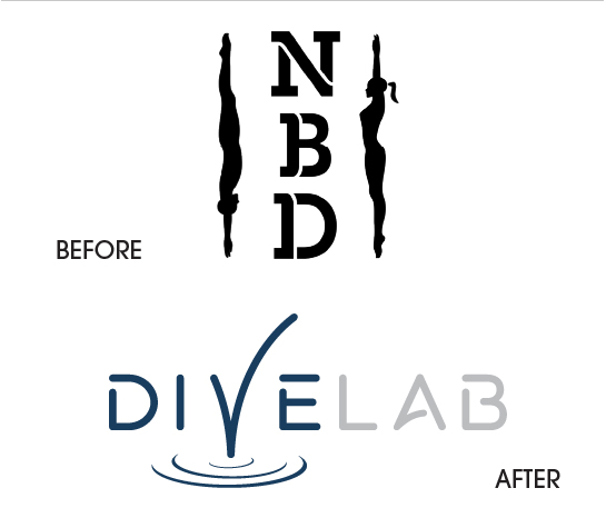
Dive Lab, formerly North Bay Diving, is located in Marin County, California, just north of San Francisco. North Bay reached out looking for a rebrand to coincide with its move to a new elite-level facility. The move would allow it to grow and carry out a broader vision for the program as a non-profit organization creating access to the sport and providing resources not traditionally found in youth sports programs.
Client
Dive Lab
Novato, Calif.
Youth Sports/Non-profit
Services
Brand Strategy
Visual Identity
Web Design
Launch Strategy
STRATEGY
Every project brings unique challenges and Dive Lab was no exception.
The added layer of transitioning to a non-profit meant also considering how to include strategic partners in both the short and long terms.
Challenge
Create a strategy that positions the program as an alternative not only to the handful of diving programs in the area, but also the myriad other youth sport and activity options.
Solution
A comprehensive audit helped identify key areas where the target audiences were dissatisfied with the currently available options, as well as what services and opportunities would be more well received.
Challenge
Build a framework that allows the organization to engage and recruit three distinct audiences (Parents, Participants, and Partners) that exist in harmony as part of a non-profit centered around sport.
Solution
We created three separate audience profiles, each including its own persona, archetype, messaging, and storytelling framework.
Challenge
Develop a strategy that breaks the mold for youth and recreational sports programs.
Solution
It was clear from very early on that the program would be far different from what exists in the marketplace, so at each step we had to reinforce its unique features, from the brand substance (purpose, vision, mission, values), to its voice, to a new name, tagline, and visual identity.
VISUAL IDENTITY
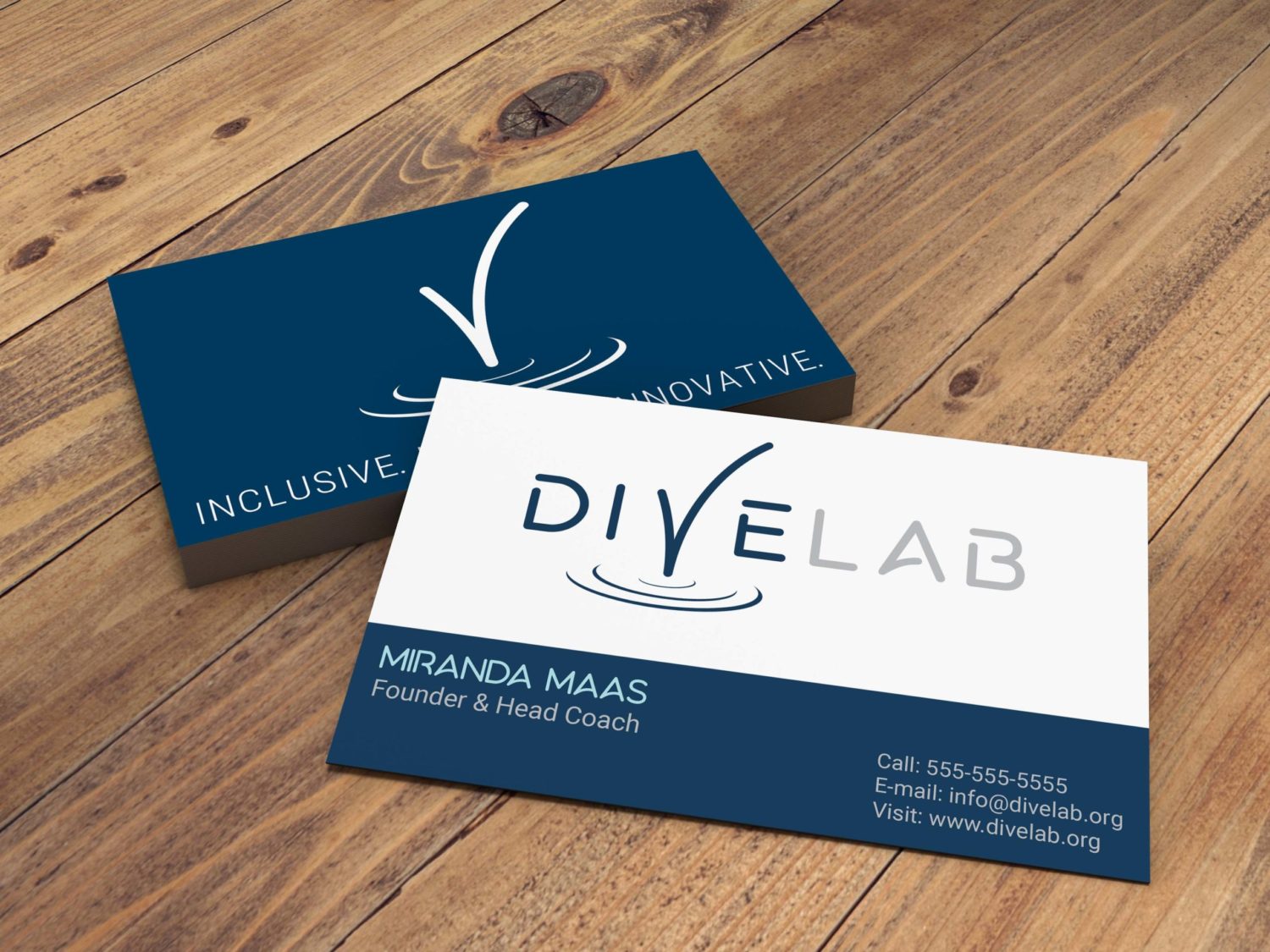
The visual identity for Dive Lab was designed to reflect both the sport and the region, through color, shape, and typography.
Challenge
Develop a visual identity that reflects the professional but laid-back spirit of the program.
Solution
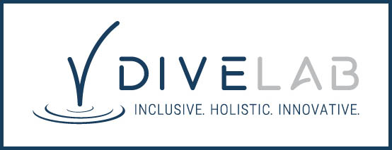
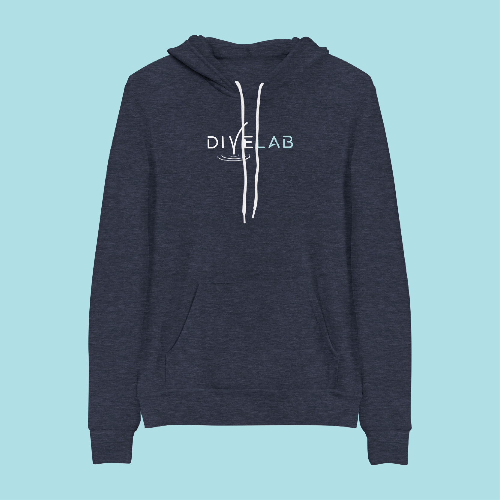
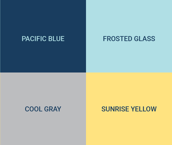
We opted to stay clean and modern, but removed the hard edges and corners for a softer, more inviting feel. The primary typography was manipulated for the logo, adding a depth and character reflective of a future-focused brand. The color palette is inspired by both the geographical region and architecture of the facility and allows for a variety of uses in deployment.
Challenge
Create a logo and system that is as unique as the program and that is responsive for varied use.
Solution
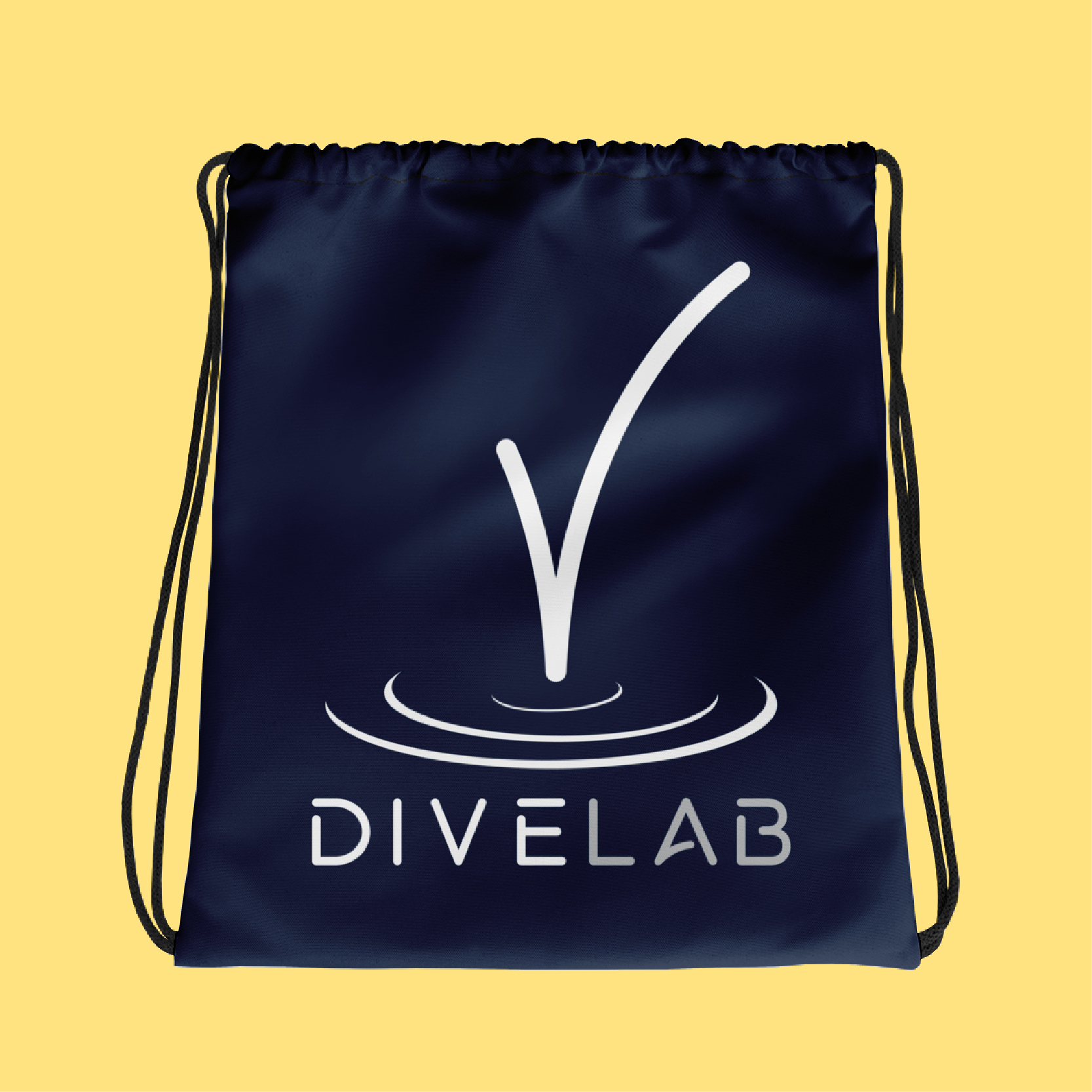
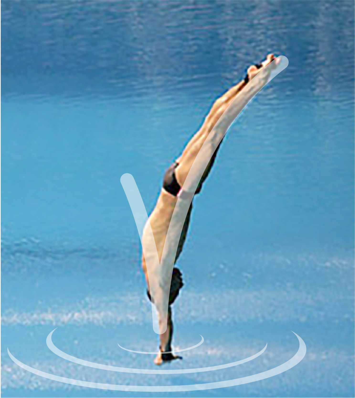
We were exhaustive in our research of competitor visuals both in the field of diving and youth sports, and in local and regional entities. In order to truly stand out, we pivoted from a silhouetted diver common in many team logos (and the previous North Bay Diving logo) and created a unique icon we call the “V-Splash” which holds the shape of a diver entering the water. This icon is integrated into the main wordmark but also can stand alone.
“We had a really positive experience working with Nick and Springboard Creative. A good communicator, Nick was collaborative throughout the whole project, and an authentic person to engage with. We initially reached out wanting to rebrand from our small, community recreational dive club into a larger non-profit which seeks to provide holistic community services through the sport of diving. It’s a long-term investment in scaling our club with a specific vision, and we wanted to make sure our branding aligned with that vision. It was worth it, and we’re really happy with how the professional rebrand reflects our mission and communicates our team culture.”
web design
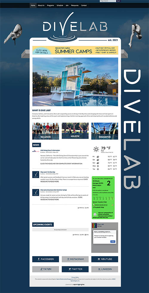
We worked within the SportsEngine platform to create a customized look beyond the template limitations, including the addition of an air quality widget and custom social media links.
LAUNCH STRATEGY
We worked with the client to lay out a six-week calendar leading up to the opening of their new facility that included events, social media posts, media releases, and more.

